December 2025

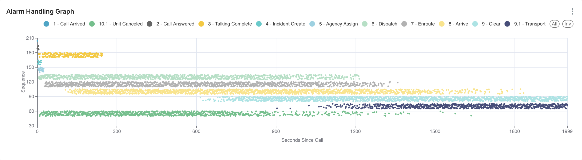
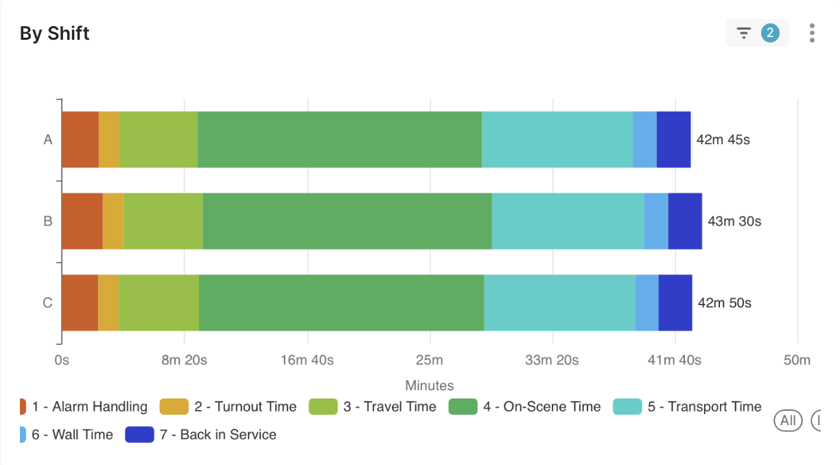
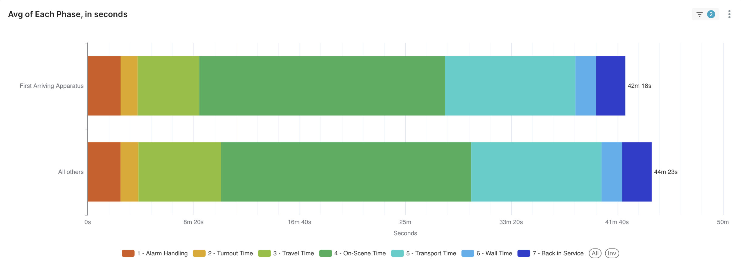
Incident Response Chart

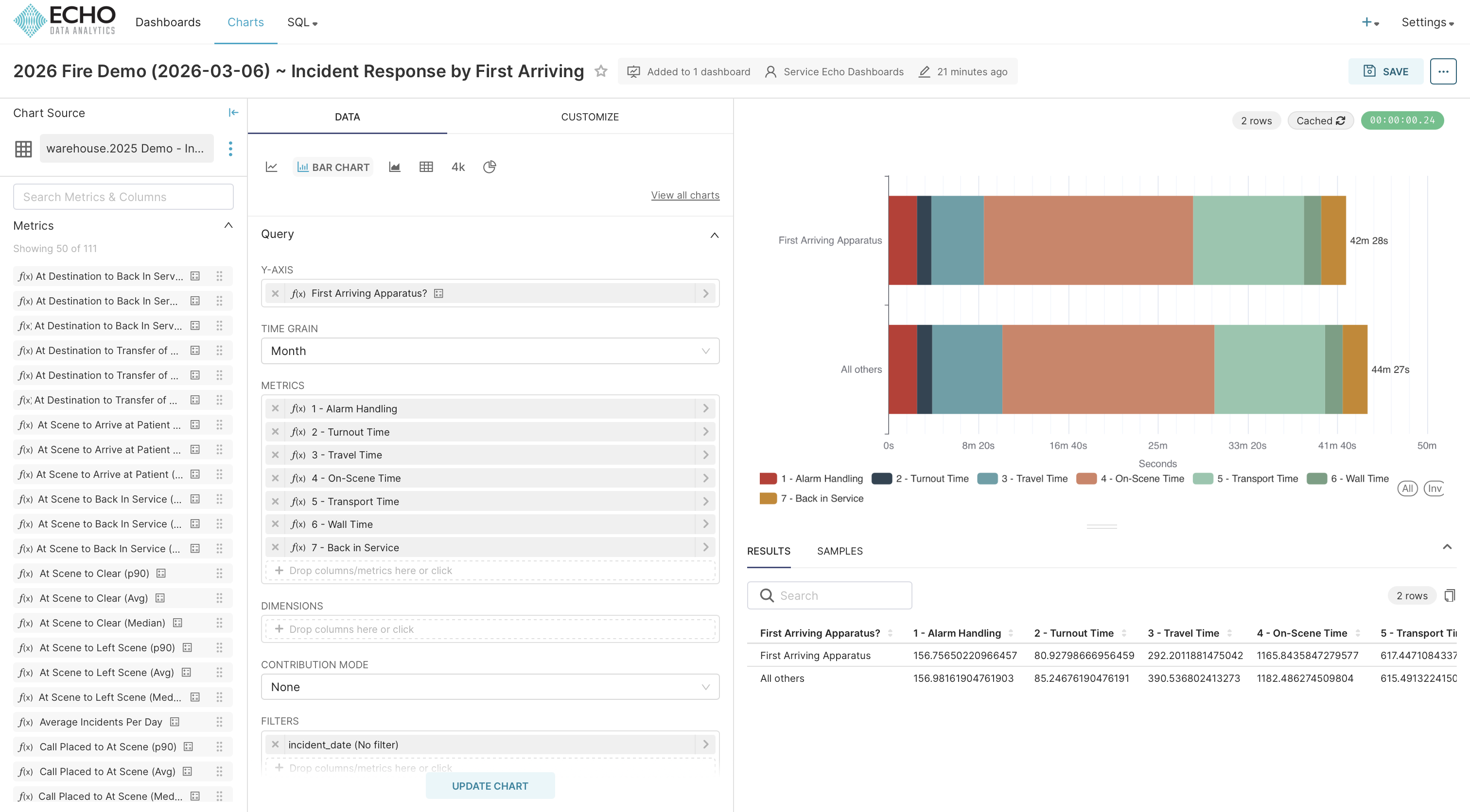
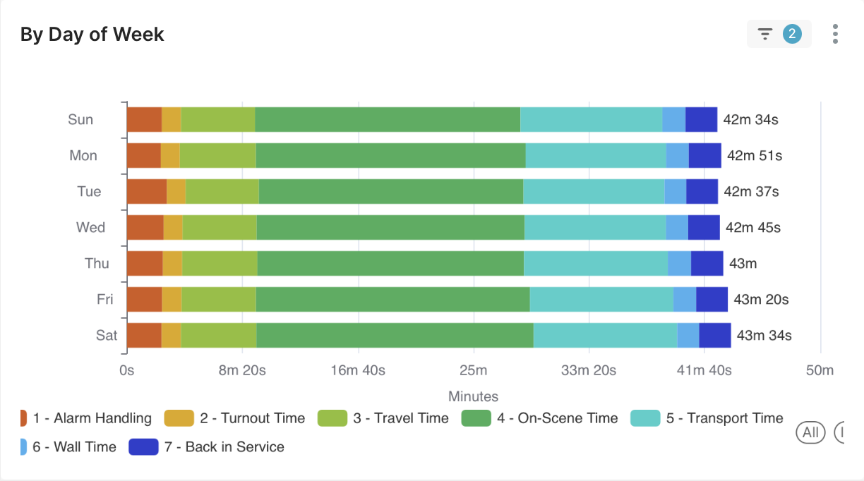
This project was completed while working as a Solutions Engineer for Echo Data Analytics. Echo creates dashboards for emergency response data for Fire and EMS Agencies. This allows the agencies to review response times, staffing levels, and incident volume trends & spikes.

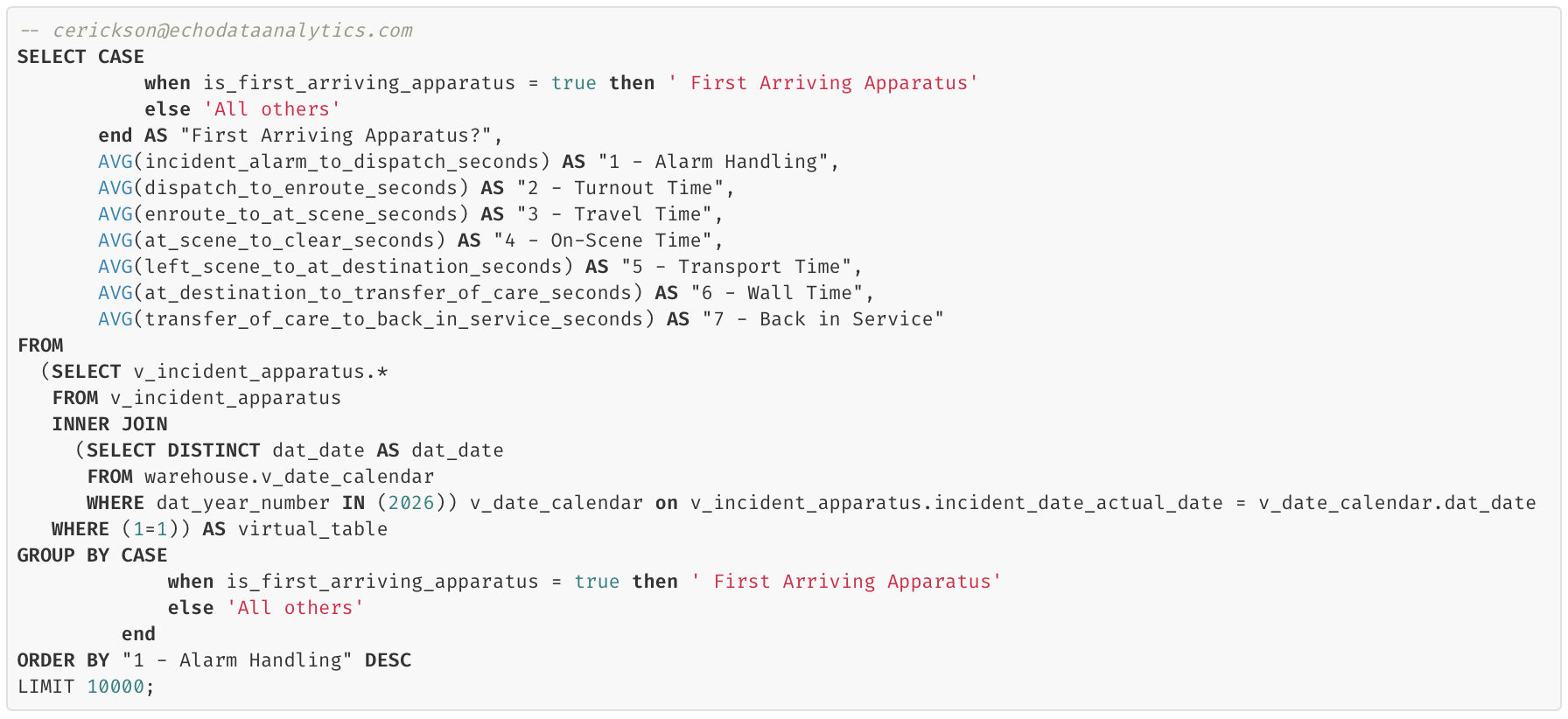
*Note - due to the sensitive nature of the incident data and HIPAA regulations, all data in this portfolio is simulated.

OBJECTIVE:

Create a way for Fire/EMS agencies to visualize the entire incident response. The solution should display relevant data whether the user is analyzing one or many incidents.

Previous Solution:

The previous graph which was used to display this information was effective only when sampling large amounts of data. When agencies were interested only in a single incident, only one dot of each color would appear, making it difficult to understand and interpret. It also required special logic with additional maintenance overhead.


New Solution:

In order to develop a new solution, I brainstormed potential ways in which the data could be displayed. I worked off of the idea that any numbers that were shown should be an average, since I believed that this would be the most effective way to make the chart scalable for sample size. I tested several graphs in order to find the clearest representation, and eventually decided to use a bar chart. I also handpicked the colors to ensure visibility and accessibility.

The solution was developed using SQL queries via Apache Superset (shown below), and then uploaded to the dashboard. In order to modify the chart’s colors, the dashboard’s JSON METADATA was also updated.

I also created two other varieties of this chart in order to display slightly different data and allow for comparison of response times:

Outcomes

In the end, I was able to make a chart which functioned for any sample size of data and which required no data pre-processing. Throughout this project, I implemented the human-centered design method in order to determine which data and what charts would be most helpful to the clients. The skillset required combined direct data analysis, UI design, and data engineering.


Last Project Home Next Project