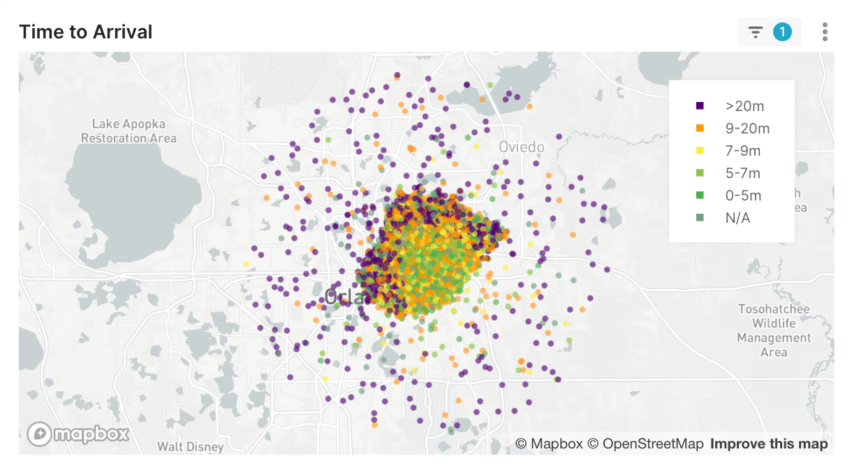
Worked as a Solutions Engineer for Echo Data Analytics (link to site). Echo creates dashboards for emergency response data for Fire and EMS Agencies. This allows the agencies to review response times, staffing levels, and incident volume trends & spikes.
Completed contract work for six weeks and worked on multiple projects. The skillset required combined direct data analysis, UI design, and data engineering to build new visualizations and validate them. Several projects involved updating charts for improved cross filtering and data breakouts. Participated in customer review meetings and marketing events. Gained knowledge and expertise in a modern analytics software stack (UI, datasets, data transforms)
Implemented the human-centered design method in order to determine which data and what charts would be most helpful to the client; addressed special requests and needs.
*Note - due to the sensitive nature of the incident data and HIPAA regulations, all data in this portfolio is simulated.
Intro Project:
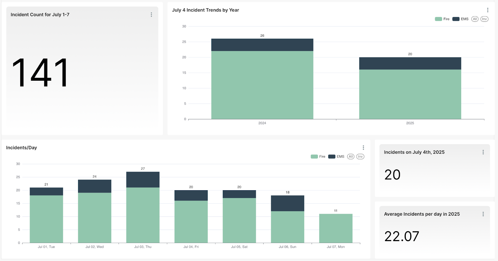
Created a new dashboard for the Chanhassen Fire Dept, to showcase their busy 4th of July week to present to the board. This was an intro project with the goal of learning the analytics toolchain. I looked at the existing Chanhassen Fire Dept’s Dashboard and worked on determining which graphs should be replicated for the 4th of July Dashboard.
New Product Prototype:
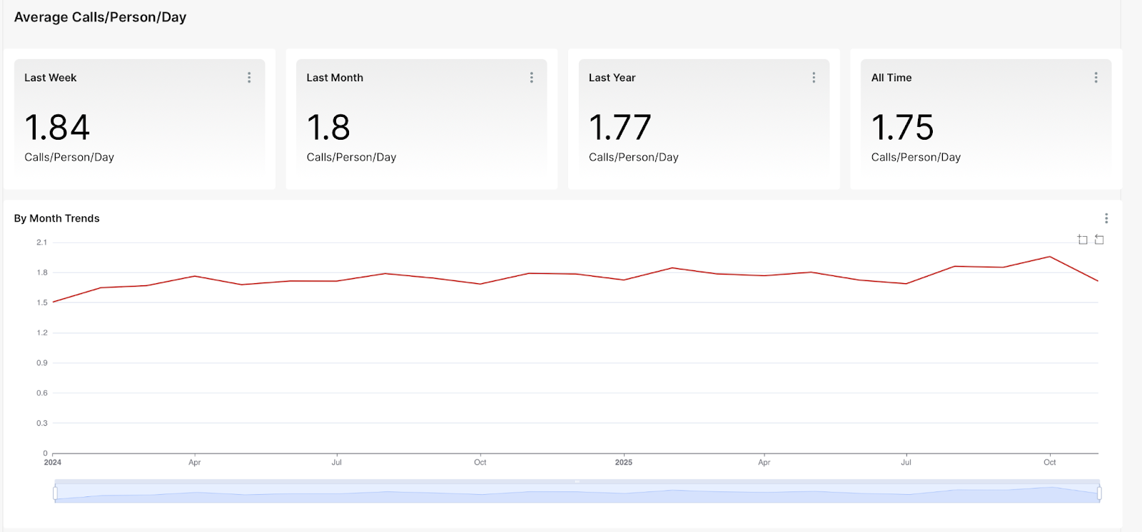
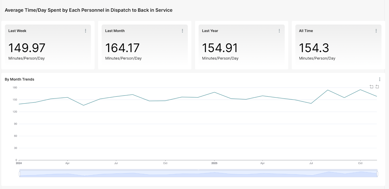
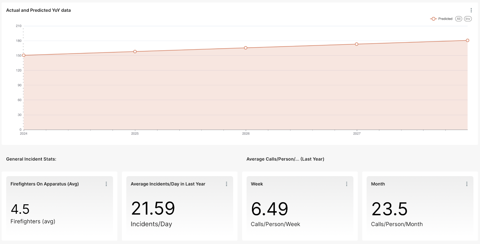
Worked to develop a prototype for a new product which focused on displaying data related to what each responder dealt with on a given day. I began by doing research on the subject and reading a book called First Responder Resilience by Tania Glenn, which delved into the issue of emergency responder mental health, which is often overlooked and under-cared for within departments, much to the detriment of their staff. I then used this information to create visualizations of first responder data, with a focus on how many calls/day they received and how much time they spent out on dispatch. The big challenge here was the need to create new charts altogether, rather than building on something that already existed. In many cases, the data slices I was using had not been used by any other chart, and presented data formatting challenges. Ultimately, I was able to prototype several different charts and develop a product prototype which gave a sense of the responsibility load of the firefighters at a station.
Dashboard Updates:
Implemented updates to the Dashboards for Chanhassen, Hopkins, Maplewood, St. Francis, St. Paul, and Lake Johanna Fire Departments. Each of these departments have slightly different dashboards and goals for data visualization, so each represented a unique challenge. Careful attention to detail was required to review community-specific data fields and identify potential discrepancies.
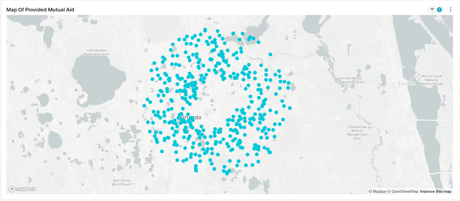
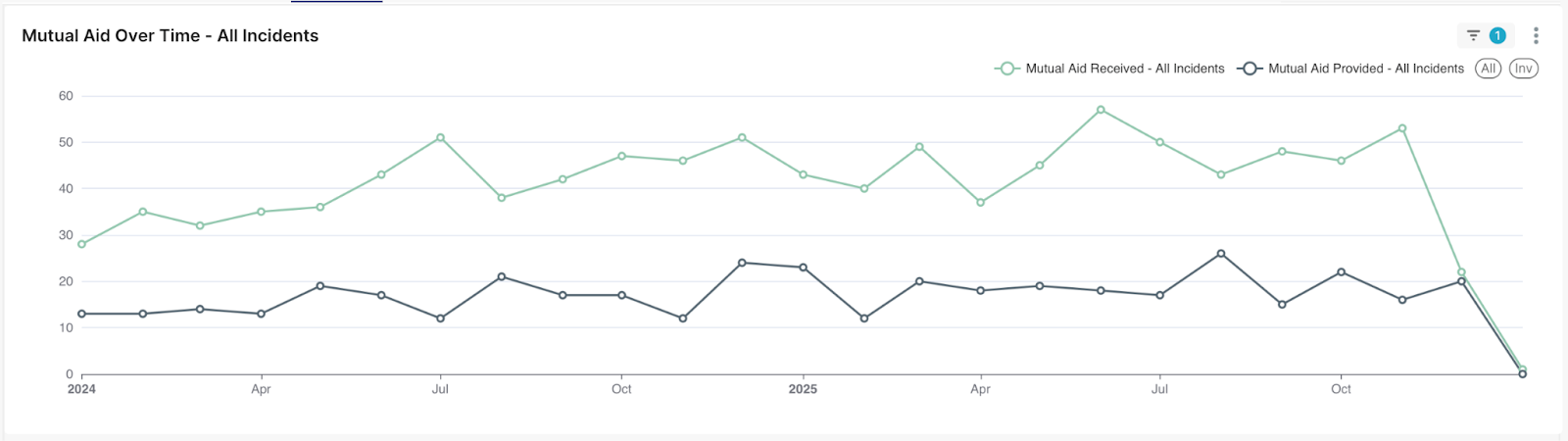
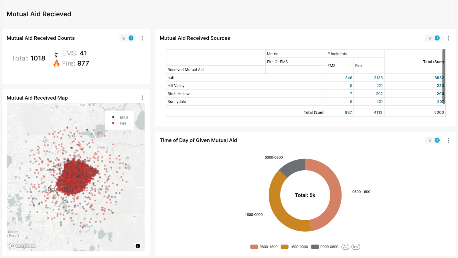
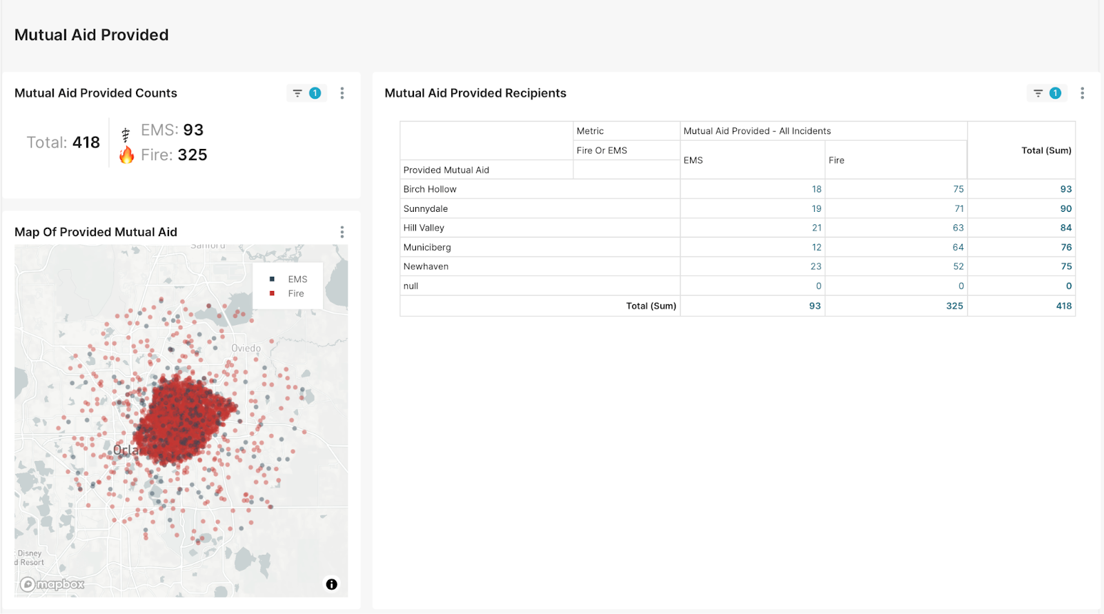
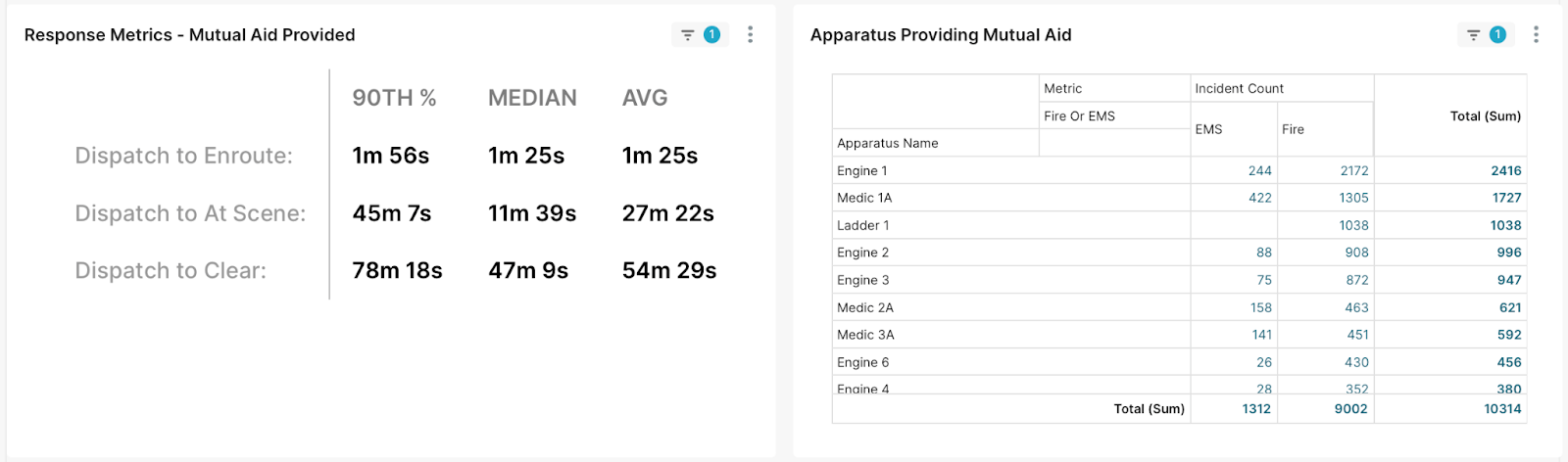
Mutual Aid:
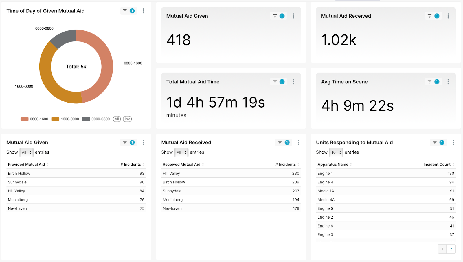
Implemented improved Mutual Aid views for several departments. This involved taking a pre-existing prototype into production for multiple customers. The biggest challenge was identifying shortcuts taken in the prototype and converting these to consistent dataset conventions. This effort required extensive testing and validation, as mutual aid is often tracked in non-standard fields from city to city.
Old:
New:
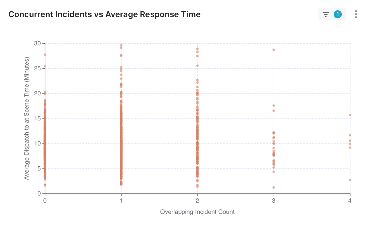
Concurrent Incidents Visualizations:
Prototyped new data views for incident concurrency (investigating how the number of overlapping incidents affects response metrics)
Lake Johanna:
Adding a City Report view for the Lake Johanna Fire Dept in order for them to more easily showcase yearly data. The main challenge was developing charts from a design concept but without access to the backend workings. This required critical thinking and interpretation, and multiple iterations to explore tradeoffs.
St. Paul:
Completely reworked the backend framework of the St. Paul Fire Dept Dashboard’s Mutual Aid view, since their data is recorded uniquely.
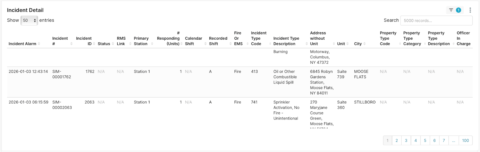
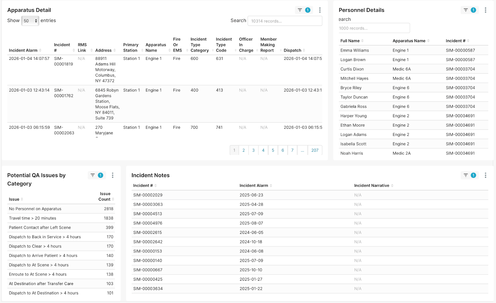
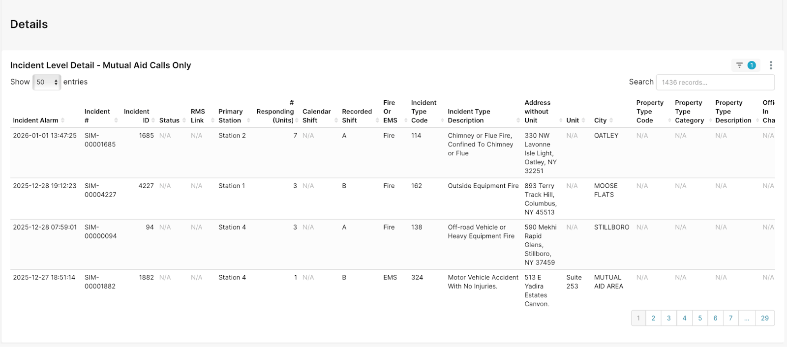
Combining Incident Detail & QA views:
Combined two complex views ("Incident Detail” and “QA Dashboard”) into one entity, since they contained similar information. This required determining which information was repeated, which charts should have higher priority placing, and other design choices. Final product shown below: